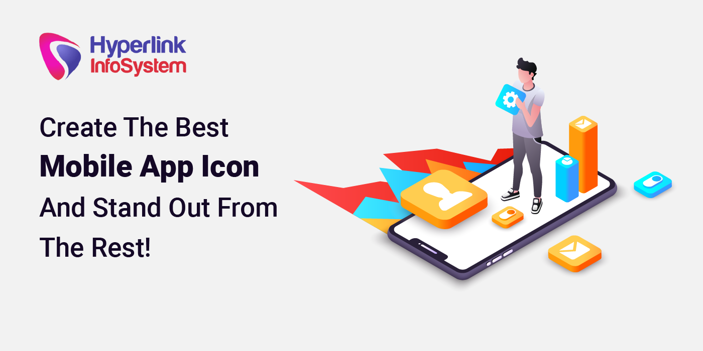
The mobile app development process is lengthy and needs a lot to deliver a phenomenal and successful mobile app. It is not easy to create an app that makes your target audience download it. And more so, more difficult it is to engage and retain them, but obviously, that comes later. That comes when at least they install it to know what the app has to offer them. There are several crucial things to consider for your users to download your app: mobile app description, name, and a beautiful app icon. A creative and best app icon by
app developer will indeed encourage your users to download your app.
Let's talk about some figures. An average mobile has around 35 to 40 apps, and if you want yours among those apps, you must aim to create an attractive app icon to appeal to the users. An attractive and eye-catchy app will undoubtedly draw your user's attention to install your app and unfold the mystery.
Today, aesthetics play an important role. Whereas in the past, the app icons were created with functionality and accessibility in mind. An app icon makes the first impression for your users; it's a touchpoint for them. Thousands of apps are present on the App Store and Google Play Store; subsequently, the pictorial depiction of your app is crucial to captivate your user's attention.
According to the research, over 90% of people are mostly influenced by visual factors while making a buying decision. Therefore, the same goes for your app. This blog will focus on a few great practices you must consider for designing your app icon to influence your users.
Define An App Icon
The first thing that your users see is your app icon. That is a touchpoint for your users. An app icon is your app's visual identity. Just like a brand has a logo, your app has an icon. Your app icon communicates the essence of your app, and therefore, it has to look pretty and up to the mark.
The Top Mobile App Icon Design Tactics
1. Avoid Overloading The App Icon

Among the few things to remember, you should consider the fact that the app appears smaller on the user's screen; hence, it is better not to overfill the icon with too many colors and details. Keep it as simple as possible yet make it look unique. You can add up to 2-3 colors and one design. The
Snapchat app icon, for instance, has a simple color scheme and design. It has white and yellow colors, with a small white ghost design in the yellow background.
Another thing to remember is that app icon colors must match with the colors inside your app to maintain brand consistency. Otherwise, it will just be two many colors and overwhelm your users.
2. Don't Use A Picture
This applies in all cases. If you have a picture you like that is unique and simple, addresses your brand, create a vector photo version of it. You can also use a few elements from the picture to inspire your vector photo design.
There are some app icon makers that you can utilize to create an amazing app icon for your mobile app. This app designs the icon by sharing the app's purpose. They provide you the photo displayed and add a letter to it, enhancing the icon's overall looks and making it look sophisticated.
3. Consider Adding A Border
The primary reason behind adding a border is to create more impact on the design or the content inside the border, thus making it stand apart in the App Store. This will ultimately lead to more app installs and more revenues. Moreover, remember that the frame you use should have a vivid color that sets off well with the colors which are within the border. Note that you can make it look more appealing with the 3D borders which are being used nowadays; however, simplicity is usually more preferred.
4. Go For Well-Defined & Unique Shape
An app icon with a definite shape makes it recognizable among your nemesis. And a unique shape makes it stand out with a tinge of simplicity added as simple things often tend to attract more.
Spotify is one of the best examples of a distinct, unique shape that implements the app's purpose into the design. They have picked two colors, green and black. The black lines in the green circle display the increasing speaker volume, as it's a music app.
5. Avoid Using Words
Your app icon will look smaller on a mobile screen; therefore, users might need a magnifying glass to read the content written on your icon. Therefore, to avoid confusion, it's better not to use words.
Creating an impactful app icon and giving your app an apt name is sufficient to captivate more people. Then, they can look at the app summary to know what it is and what it does.
6. The Right Size
Your app icon must be of the right size in accordance with the screen where it will be viewed. Moreover, Apple won't approve your app icon if it isn't rightly sized. Therefore, submitting your app to the App Store, pay attention to detail. Look for the required app icon guidelines to follow, ensuring that your app is approved. The last thing you want is to waste all the effort and money on a small error that you could have corrected initially.
7. Lastly, Create A Prototype

After you are done thinking about the design, shape, size, and everything, create a prototype sketch on paper and fill it with colors as the thought of to help you decide if this is what you actually want. Creating a prototype is truly helpful to determine your final decision.
Final Words
An app icon is an essential part of your
mobile app development process because it is the first contact point for your users. A well-defined and innovative app icon can influence potential users to download your app and use it.
Now that you have all the necessary information for creating a fantastic app icon, good luck with your journey. If you are a business owner and need the right mobile app development to help you with it, contact top
app development companies and share your unique ideas.
![]()

